
When Updating Or Creating A New Website – Make It Responsive
by Josette Millar
It’s no secret; today’s technology moves at a rapid-fire pace, and it’s easy to get left in the dust if you’re not paying attention. Just a few short years ago, many tech experts perceived the idea of a responsive website as the next big trend – one that many thought would evaporate from the scene just as quickly as it arrived while others tried to hold firm to the fact that this was to be a design feature of the future. That’s a crazy concept in 2015, considering today’s world.
So this begs the question: What exactly is a responsive website, anyway?
Think back to a time, not long ago, when your Internet interactions occurred on your desktop. You read your daily mail bits from the discomfort of your rolling chair, shopped for special gifts by way of that stationary screen, and researched this-n-that’s using the mouse tethered to that big box. Back then, there was no need for fluidity in website design because, well, a website was a website.
Now think about the last twenty four hours. If you’re like millions of people, you’ve likely scoured sources with your cell phone, plugged away at your laptop, and toted your tablet along for some action, too. This is today’s world, and with so many ways to deliver and consume media, a responsive website only makes sense.
A responsive website is built to adapt to all of the potential delivery methods that someone might choose to use. It’s the best of both worlds. This web design technique makes life easier on the consumer because web content magically appears to be made-to-order depending on the device being used, and web developers and designers no longer need a multiple websites for multiple viewing tools.
Sure, you could consider a responsive website a thing of the future (because this design isn’t going anywhere anytime soon), but you should consider it a thing of right now because, chances are, your competitors are navigating the waters of fluid web design.
Check out how a responsive website makes each of these companies’ navigation more user-friendly:
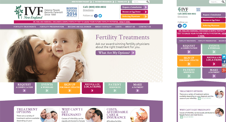
- IVF New England. As a medical facility, IFV New England has the goal of delivering as much information as possible to potential patients. This can be challenging, as too much information can easily overwhelm visitors and have an adverse effect. On the desktop version, you can easily find a category that fits your needs, and explore further. While the horizontal flow of this setup wouldn’t be optimal for mobile viewing, the responsive website is able to utilize the exact same information in a vertical format that’s friendly for phone users.
- Dog Film Festival. The desktop version of Dog Film Festival‘s site is pretty similar to the mobile version in terms of the visual presentation. On your phone, you’re able to see all of the messages and images, just as they’re meant to be viewed. The big difference with this one? The main navigation bar on the desktop would be too cumbersome to fit properly onto a mobile device. The solution? You can easily view the navigation options by selecting the menu bar that appears at the top right of the mobile version.
- Language Testing International. Similar to the Dog Film Festival’s situation, LTI‘s major obstacle, if responsive websites didn’t exist, would be the navigation tool. Fortunately, the mobile version affords visitors the ability to simply choose from the drop-down menu to easily arrive at their destinations.
Are you in the process of changing over to a responsive website? Get in on the conversation at our Sheffield Media Group Facebook page!